

Input elements
The <input> HTML element is used to create interactive controls for web-based forms in order to accept data from the user. The <input> element is one of the most powerful and complex in all of HTML due to the sheer number of combinations of input types and attributes.
The <input> element is the most important form element.
input types
An input varies depending on the values of its type attribute. The <input> tag specifies an input field where the user can enter data.
The <input> element can be displayed in several ways, depending on the type attribute.
The different input types are as follows:
button
A clickable button with no default behavior displaying the value of the value attribute, by default this button is empty
<input value="button" type="button">

checkbox
The checkbox is shown as a square box that is ticked (checked) when activated. Checkboxes are used to let a user select one or more options from a limited number of choices.
<input type="checkbox">

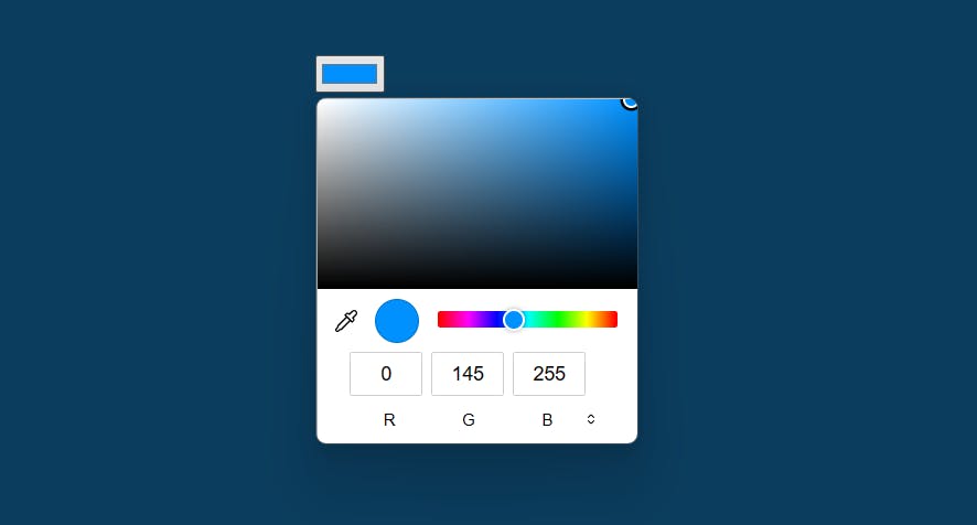
color
A control for specifying a color; opening a color picker when active in supporting browsers.
<input type="color">
Date
A control for entering a date(year, month, and day, with no time).
<input type="date">

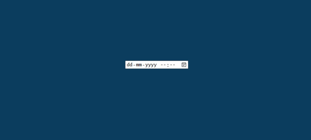
Datetime-local
Defines a date picker. The resulting value includes the year, month, day, and time.
<input type="datetime-local">
A field for editing an email address.
<input type="email">

File
A control that lets the user select a file. Use the accept attribute to define the types of files that the control can select.
<input type="file">

Image
A graphical submit button. Displays an image defined by the src attribute. The alt attribute displays if the image src is missing.
<input type="image">

Month
A control for entering a month and year, with no time zone.
<input type="month">

Number
Defines a field for entering a number.
<input type="number">

Password
A single-text field whose value is obscured. Will alert the user if the site is not secure.
<input type="password">

Radio
A radio button, allows a single value to be selected out of multiple choices with the same name value.
<input type="radio">

Range
Displays as a range widget defaulting to the middle value. Used in conjunction min and max to define the range of acceptable values.
<input type="range">

Reset
A button that resets the contents of the form to default values.
<input type="reset">

Search
A single-line text field for entering search strings. Line breaks are automatically removed from the input value. May include a delete icon in supporting browsers that can be used to clear the field.
<input type="search">

Submit
A button that submits the form.
<input type="submit">

Tel
A control for entering a telephone number. Displays a telephone keypad in some devices with dynamic keypads.
<input type="tel">

Text
The default value. A single-text field. Line breaks are automatically removed from the input value. The default width of the text field is 20 characters
<input type="text">

Time
A control for entering a time value with no time zone.
<input type="time">

URL
A field for entering a URL. The input value is automatically validated before the form can be submitted.
<input type="url">

week
This, allows users to select a week and year. A date picker popup is visible whenever you will give a user input to the week input type
<input type="week">