

In this article, I'll walk you through the CSS flexbox properties so you can make your own creative, responsive websites. I'll explain how Flexbox's properties work.
What is Flexbox?
Flexbox or flexible box is a one-dimensional layout model that provides an easy and clean way to arrange items within a container.
The flexbox is used to make the elements behave predictably when they are used with different screen sizes and different display devices.
Here is an example,

So let's get started.
Flexbox contains flex containers and flex items.
Let's take an example to show four flex items within a flex container.
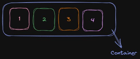
Flex container: The flex container specifies the properties of the parent. It is declared by setting the display property to the parent element.
Flex-items: The boxes inside the above container are the child element or flex items. There may be one or more flex items inside a flex container.
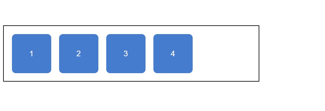
Let's code with some HTML and CSS so that we can create the container and boxes in our browser and apply flexbox properties.
 <div class="container">
        <div class="box box-1">1</div>
        <div class="box box-2">2</div>
        <div class="box box-3">3</div>
        <div class="box box-4">4</div>
    </div>
.container {
  border: 2px solid #000;
  width: 40%;
  padding: 20px;
  display: flex;
  flex-direction: row;
  font-family: sans-serif;
  gap: 20px;
}
.box {
  height: 100px;
  width: 100px;
  border-radius: 10px;
  background-color: #457cce;
  display: flex;
  justify-content: center;
  align-items: center;
  color: #fff;
  font-size: 20px;
}
The output looks like this
Flexbox properties
Display
The display property is applied to the parent element
.container{
display: flex;
}
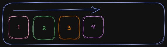
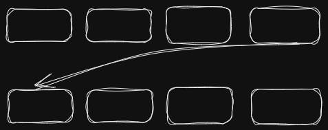
By default, the flex items are set along the horizontal flex-line, from left to right:
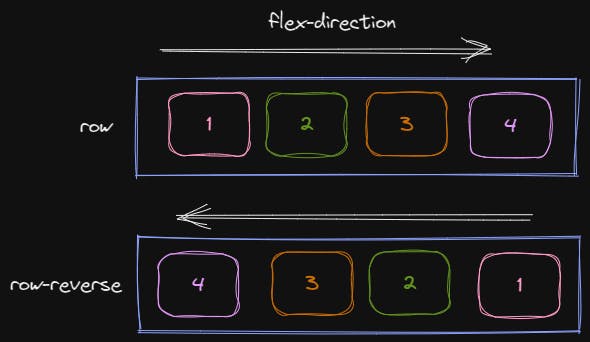
flex-direction
The flex-direction property is used to set the direction of the flexible items inside the flex container. As I mentioned above, its default value is a row. (left to right).
The values are:
.container{
  flex-direction: row | row-reverse | column | column-reverse;
}
The Example below shows row and row-reverse value
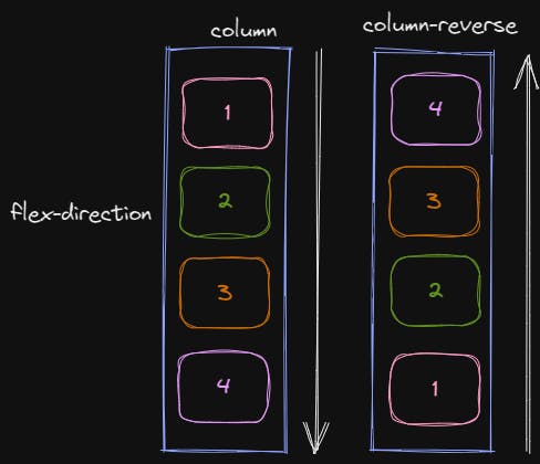
Let's take an example to demonstrate the usage of the column value
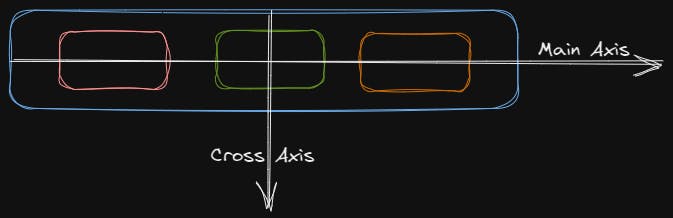
Justify-content
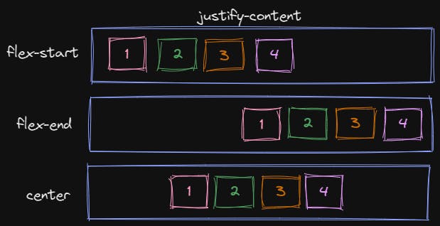
The justify-content property is used to define the alignment along the main axis. It sets the Flexbox container's item horizontally.
flex-start: It is the default value. It sets the items at the beginning of the container.
flex-end: It sets the items at the end of the container.
center: It sets the items at the center of the container.
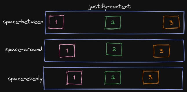
space-between: items are evenly distributed in the line; the first item is on the start line, and the last item is on the end line
space-around: items are evenly distributed in the line with equal space around them.
space-evenly: items are distributed so that the spacing between any two items (and the space to the edges) is equal.
Flex-wrap
By default, flex items will all try to fit onto one line. You can change that and allow the items to wrap as needed with this property.
.container {
  flex-wrap: nowrap | wrap | wrap-reverse;
}
nowrap(default): all flex items will be on one line
wrap: flex-items will wrap onto multiple lines, from top to bottom.
wrap-reverse: flex-items will wrap onto multiple lines from bottom to top.
Align-items
This defines the default behavior for how flex items are laid out along the cross-axis. Think of it as the justify-content version for the cross-axis (perpendicular to the main axis).
.container {
  align-items: flex-start | flex-end | center | stretch | baseline
}
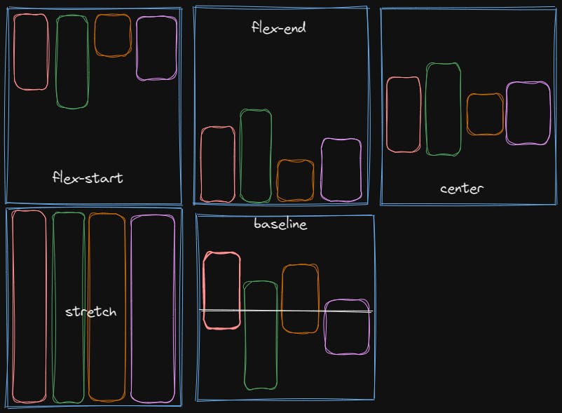
flex-start: items are placed at the start of the cross-axis.
flex-end: items are placed at the end of the cross-axis.
center: items are centered on the cross-axis.
stretch: stretch to fill the container.
baseline: items are aligned such as their baselines align
Align-content
.container{
align-content: flex-start | flex-end | center | space-between | space-around | stretch;
}
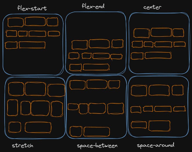
flex-start: items packed to the start of the container.
flex-end: items packed to the end of the container.
center: items centered in the container.
stretch: lines stretch to take up the remaining space.
space-between: items evenly distributed; the first line is at the start of the container while the last one is at the end.
space-around: items are evenly distributed with equal space around each line.
Align-self property
This property works on the child classes. It positions the selected item along the Cross Axis.
.box{
align-self: auto | flex-start | flex-end | center | baseline | stretch;
}
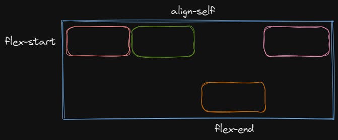
align-self is a property that you can apply to individual items.
flexbox makes a lot of layout tasks much easier. Such as,
Vertically centering a block of content inside its parent.
Making all the children of a container take up an equal amount of the available width/height.
Making all columns in a multiple-column layout adopt the same height even if they contain a different amount of content.
Thank you,
Shon
Reference
MDN
CSS Tricks
W3Schools
Joy Shaheb